

iPad On-Device Activation
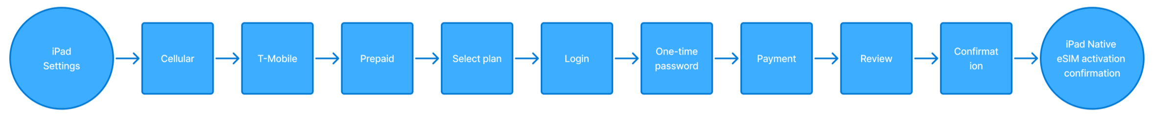
I redesigned the end-to-end T-Mobile On-Device iPad activation experience, allowing users with eSIM-compatible iPads to easily choose and activate prepaid plans directly through native iPad settings..
Project Goals
Simplify the user journey by removing extra steps and fixing layout inconsistencies.
Update and consolidate outdated plan options.
Integrate Arrow Design System components for a modern, consistent experience.
Iterate and evolve features based on insights and user needs to deliver a smoother, more intuitive experience.
Challenges
The experience is web-wrapped inside Apple’s web-sheet, limiting deep linking and navigation. Exiting the flow interrupts the user’s progress and requires restarting the process.
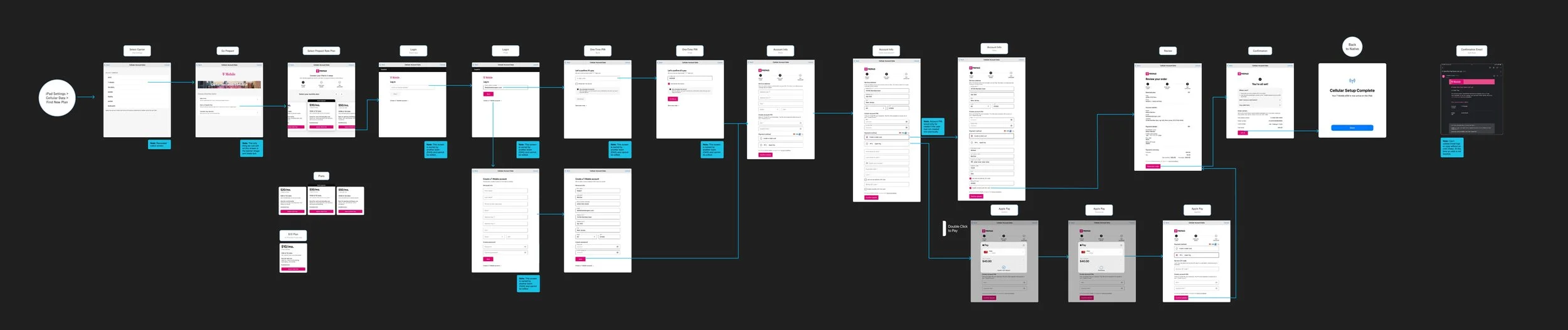
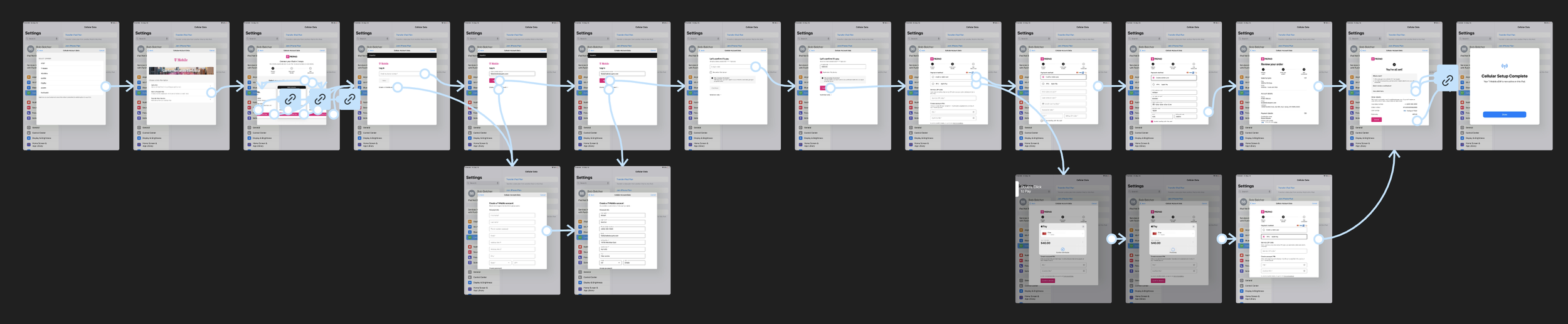
Design Journey
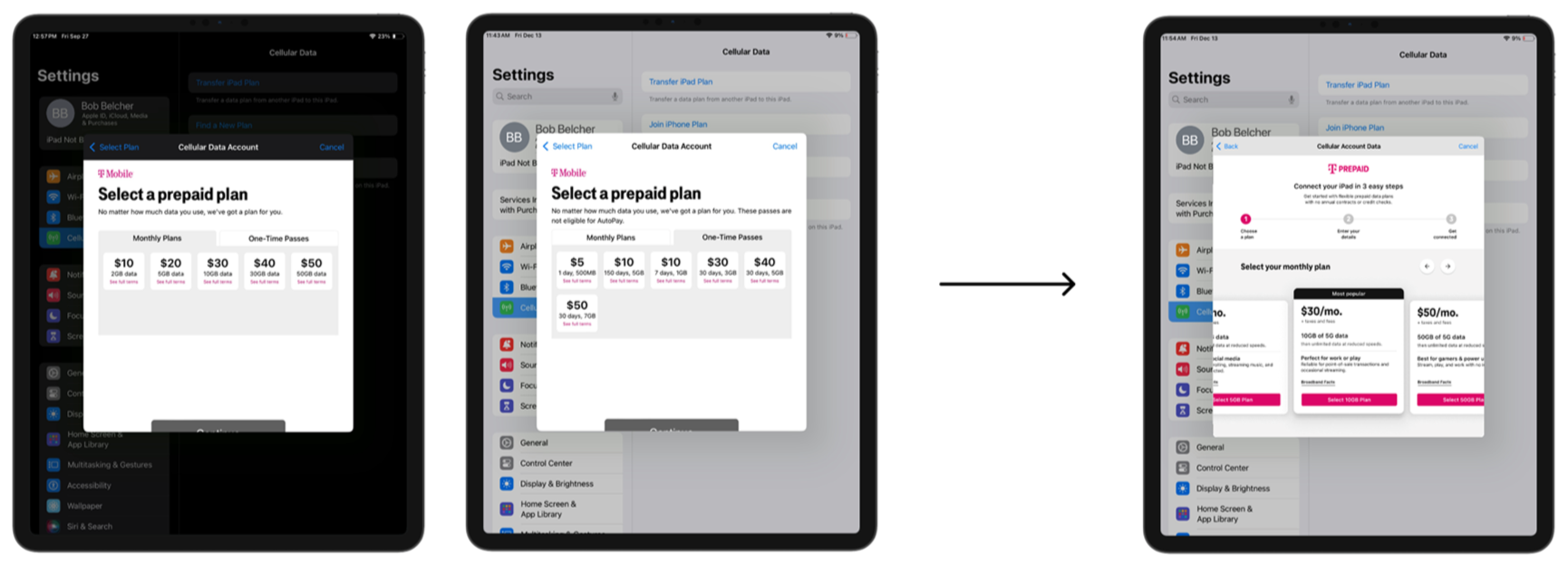
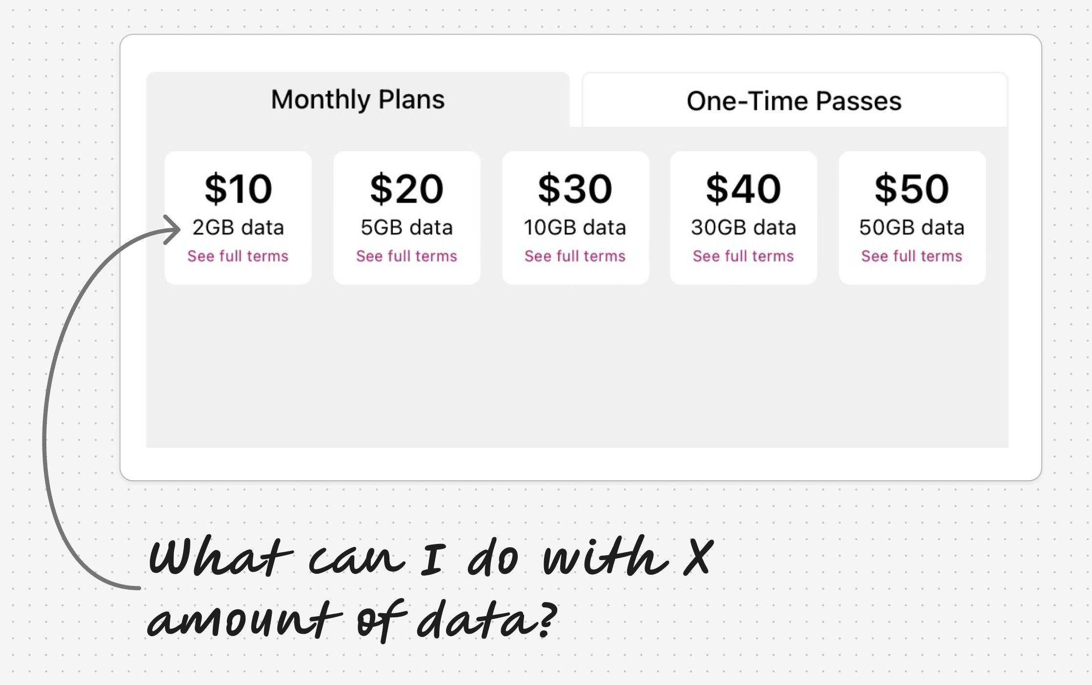
Step 1 - I met with the Product Manager to gain a deep understanding of the existing experience and identify areas for improvement. We decided to reduce the number of plans from 11 to three. My product partner looked into the popularity of each plan and we were able to determine that customers preferred the monthly plans as opposed to the one-time data passes, as well as, which plans were the most popular. While reviewing the plans I felt that it was important that we make it clear to the user how much data they were getting and what they could do with that data to make plan selection easier.
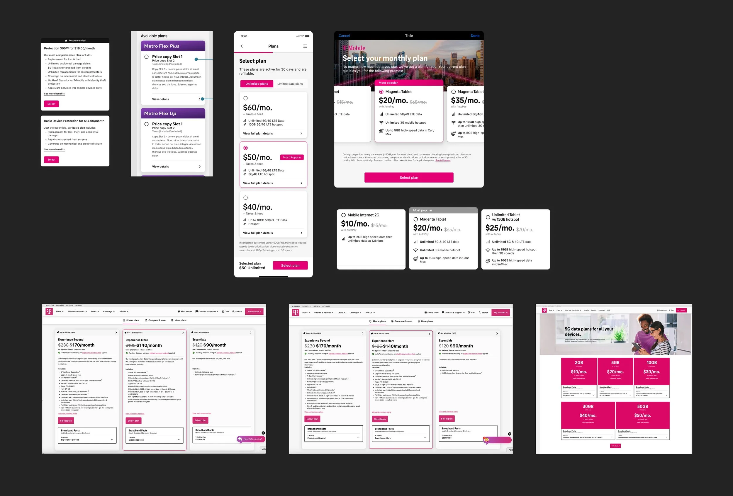
Step 2 -I collected screenshots for benchmarking plans across T-Mobile experiences, competitors, and other relevant flows.
Step 3 - I spoke with the Prepaid team about the plans and how I wanted to make it easier for users to select the right plan for them. Even as a designer at a telecommunications company I still wasn’t sure how much data I would need for my iPad. Other designers on my team were excited about revamping the plan cards and helping me determine a path forward so I planned a FigJam working session for some crazy 8s.
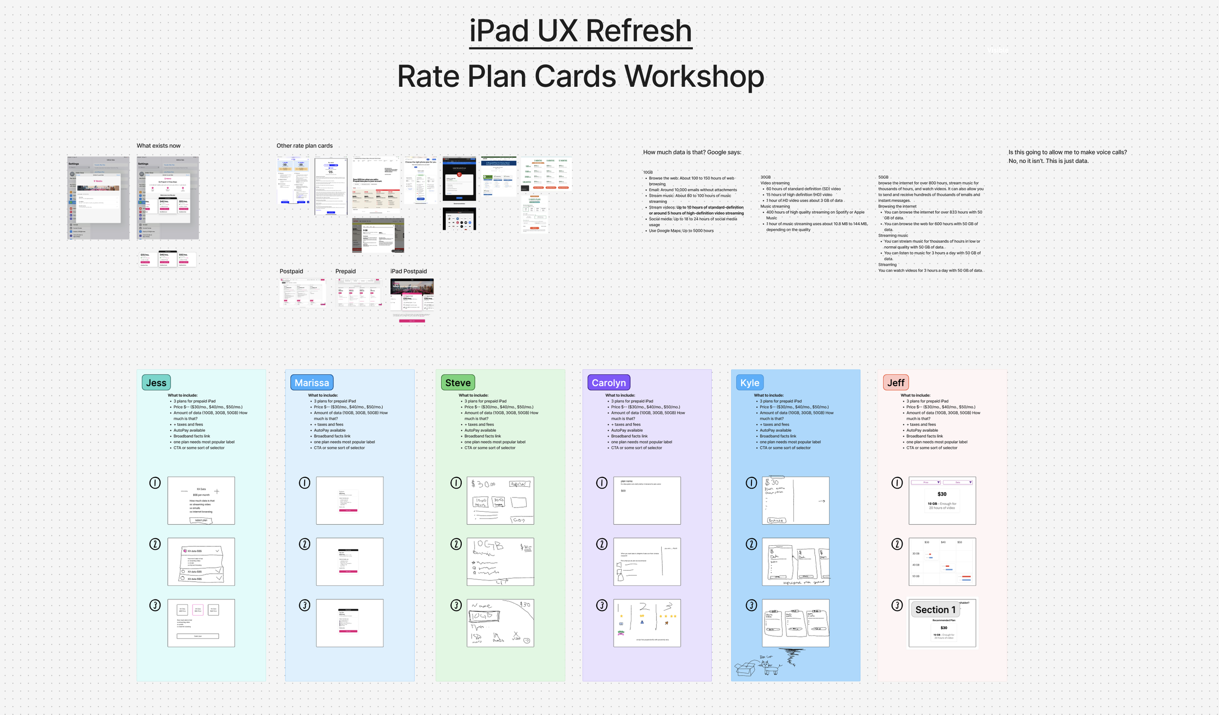
Step 4 - Following the working session, I consolidated layout concepts and gathered insights to simplify the plan selection process.I gained a deeper understanding of the legal considerations around communicating data usage, so I moved forward by adding clear, compliant language describing what each plan is best suited for. I then created my first draft of the flow.
Step 5 - I partnered with the content team to create copy that would help users select a plan.
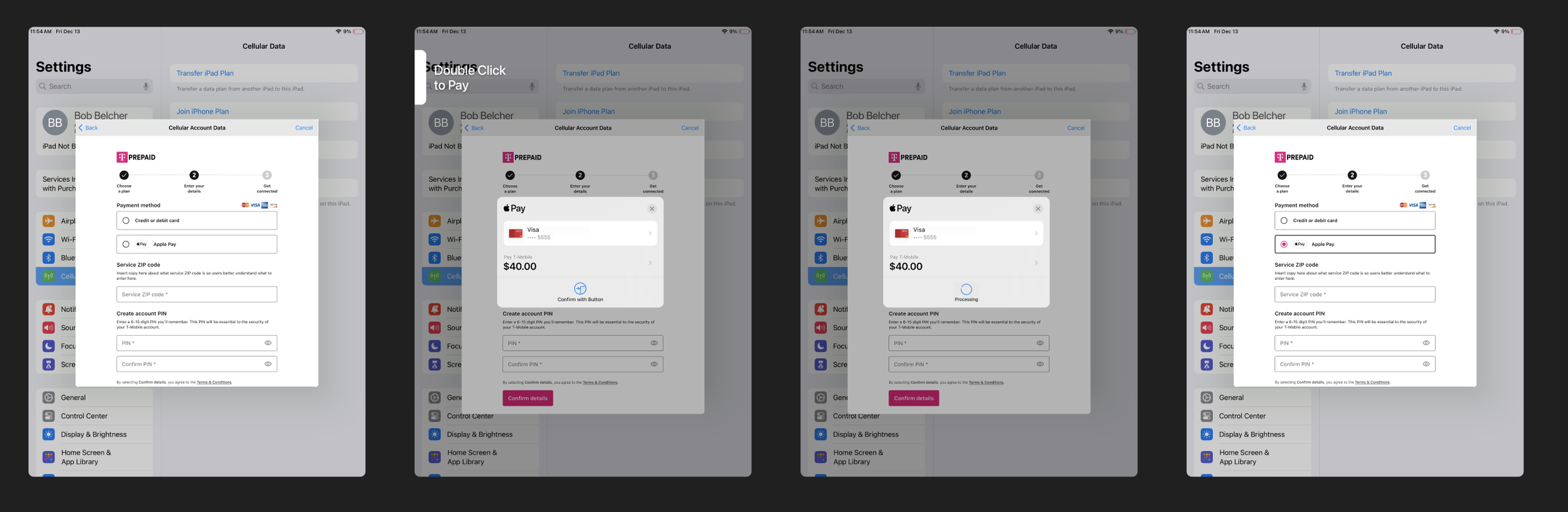
Step 6 - I met with research to introduce the flow and design challenges. They conducted two rounds of usability testing with 10 total participants. The prototype included three different plan screens. 9 out of 10 participants preferred the large horizontal carousel plan layout. It was also determined that participants were inclined to choose larger plan options because they didn’t want to run out of data. 5 out of 10 participants wanted more specific information about plan data. Participants also helped determine parts of the flow that needed more clarity like Service ZIP code and they suggested we add in Apple Pay.

Step 7 - Following testing the designs were revised and presented to the Prepaid team in a weekly feedback session. From there I iterated based on feedback.
Step 8 - Next the designs were presented to upper management. It was recommended to move away from the progress indicator in the design system and better explain the journey to the user. So, a different progress indicator was implemented.

Step 9 - Finally, the designs were presented to the VP of design. She recommended I connect with marketing to make some image updates. She also recommended removing some magenta and switching to black in places to only use T-Mobile’s magenta color in places that indicate moving forward through the flow. After I implemented her feedback the designs were handed off to dev.
Step 10 - The designs were handed off to the dev team.
Project Outcome
This project sparked a company wide exploration on plans led by a Principal Designer on the Prepaid team.
This project is in development.